I am no designer. At least I can't say that I have an artistic eye but there are a few fundamentals, not necessarily reserved to designers, that we should all know when designing web pages. Not many years ago, the maintainers of websites were called webmasters. To me it sounded like old wizards, comical yet very knowledgeable in their field.
The Webmaster's task was to build and maintain a whole web application from the ground up. In modern days, the closest we can translate a webmaster to is a full stack developer. But not quite. The webmaster even contributed to the content of the website and wording in advertising. He had a say in every little nit pick that exists on the website. Today, the job is more diverse and we have different teams handling different sections of the same web page.
I would say a lot, if not all, of webmasters were terrible designers and the tradition carried on to full stack developers. And I include myself in that list. What makes sense to me, looks horrible to others. What looks beautiful to me, is an embarrassment to others. I am not telling you this so you throw away your code and buy the first book about design. All I want to tell you is, despite how horrible people say Craigslist look, it is still one of the most successful website around.
It does so by doing one thing right in particular. It is legible.
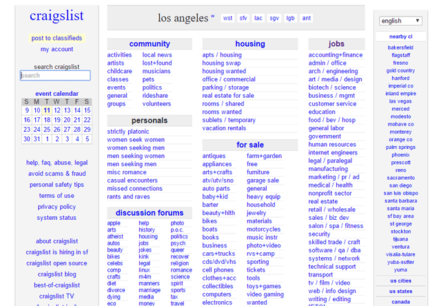
Say what you want, but you can read everything on this page.
Trends come and go, but one thing that stays is the text we read on those web pages. No matter what the trend is, we have to make sure text is legible.
Remember the days where writing text like this was common? The choice of colors was not important at all. We just left the placeholder colors that were intended for development. Chances are you will just skip ahead because this text is not legible.
How about this one? This format was so common that it was even used on Android developers websites. It may have looked cool and modern but even with my perfect vision I can't read a full paragraph without overlapping.
Using the right font is important, but more important are the colors. And by colors I simply mean the range from black to white.
This paragraph is easy to read because it uses a good amount of contrast without hurting your eyes. The background is not 100% white, and the text is not 100% black. To know this, you don't have to have user compliment your design, instead they are not supposed to notice it. Sad for designers that good work means not being noticed at all.
A busy background also breaks the legibility. It was very common for webmasters to have image background over the whole website, not thinking about the text on top of it. I usually select text on cases like this to have an artificial contrast to help me read better.
Getting design is not an easy task. But focusing only on the text is something even us non-designer can try to do. Here is a good resources for developers who want to design at least for text, without sacrificing their work too much:
7 Rules for Creating Gorgeous UI (Part 1) by Erik Kennedy
It is a good intro that will take you from being a bad designer, to the very least a mediocre one.


Comments
There are no comments added yet.
Let's hear your thoughts