Remember flashy website backgrounds from the 90s? Everyone had them. They didn't make the website look any better, in fact, they made it harder to read and were distracting. But everyone still used them simply because it was the popular thing to do. Most websites today use the flat design, including this one, kind of. Maybe someone did the research and found it to be more pleasing to the eyes. But I don't know that, I did it because I thought it was cool.
When I was building a comment system for this website, I went on other websites and copied the format. This is not an isolated case, developers and designers are always looking at other websites to find new ways to implement their structures. But sometimes we copy things without understanding them. I built my commenting for the sake of building a comment system, not with the intention to promote discussion on my website.
On the web, things that are popular become a standard with no real explanations. We turn a blind eye and follow simply because everyone is doing the same. But sometimes, some folks go out of their way to make things better. And when they do, you notice the difference.
On stackoverflow.com, commenting is not built like any generic system. It is built for users to make small comments or ask quick questions to clarify the original question. If you try to use it as a discussion platform you are quickly discourage, not by another user, but by the Just in Time system.
... a simple reminder at the time of the temptation is usually all it takes for people to suddenly "remember" their honesty — Jeff Atwood
What this means, when you try to have a discussion on the commenting section, the system tells you that your comment is too long and turns it into an answer instead. If you try to answer a question with something that doesn't look like an answer, you are suggested to write a comment instead. These are not some rules that you have to memories. They appear Just In Time right before you perform your action. They sort of nudge you into the right direction. This is the same system used to promote empathy on the web and turn trolls into productive members of society.
On the other hand, you see some websites that try to prevent people from cursing on the comment section. They add regular expression to remove every profane word. Including the word A**ociation, or my old workplace HD B***ercup. They end up ruining the experience for everyone without really protecting from the dedicated troll who can now use emojis or unicode to write bad words anyway. BѠbs
/人 ◕ ‿‿ ◕ 人\
Instead, what they could do is have a gentle reminder pop up when it detects profanity on your text. "Remember that it is another human being behind the other screen reading your comment."
Have you ever written an email and forgot to attach a file? You make comments about the file you want to attach but right before it is time to add the file you forget and press send? Well look at what happens when you do so on Gmail?
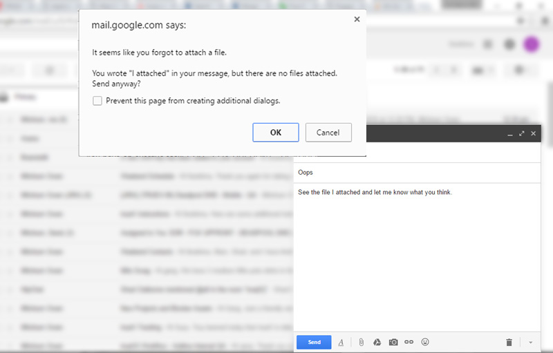
Alert: You said you attached a file but I don't see any attached files. — Gmail
They could have a system of check boxes that you have to mark before sending a message to ensure that you cannot send an email without attached files, but you might forget to check those too. Instead, you are gently reminded right when you need it.
When chatting on Hangout on a mobile device, if a person asks you "where are you?" a small icon appears. When pressed, they can see your current GPS location. This can be very convenient when I am stuck in traffic and quickly want to show where I am.
When I was building my first serious website, I designed a bunch of features that users decided to use their own way. I had no clue what the user wanted or how they wanted it. I was paranoid at some point because everyone was doing exactly what I didn't want them to.
I went back to the drawing board and designed a new feature for the website. A commenting system.
Now if people felt the need to express themselves, wanted to leave a comment about a tutorial or say thank you, they could do it. But the Internet being the Internet, this is not how my users used the comment system. One person decided to give scores to tutorials. He would read a tutorial and score it on a scale of 1 to 10. Other people followed his lead and rated things in a very inconsistent manner. That frustrated me. Some rated it on a scale of 1 to 5, some gave it a thumbs up, and one guy gave a tutorial a B. This gave me an idea for a new feature. I built a rating system.
With the shiny new rating system in place, no one would use the comment section to rate, instead they could just click on the little stars and that was that. Not surprisingly, people started rating tutorials.
But now, the comment system was no longer being used.
Instead of being frustrated, this is an opportunity to learn how design affects behavior, and to understand that it really does affect behavior.


Comments
There are no comments added yet.
Let's hear your thoughts