I had the chance to implement more than my fair share of AB tests. I used Google Web Optimizer, Visual Web Optimizer, Optimizely, an internal AB test suite, and even wrote my own at some point. I do not claim to be an expert in anyway because there are a too many ways to interpret the results. I cannot tell you the right way to track conversion but I sure can tell you when the metrics are completely irrelevant.
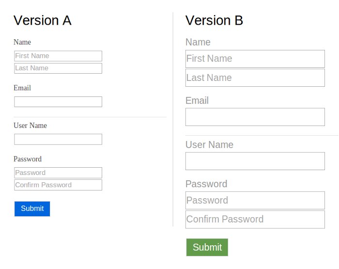
The submit button
A new form was created to allow users to subscribe to a website. The designers came up with multiple versions that mostly differed in color and font size. Because a decision could not be made on which version is the better, an AB test was in order.
One of the two is going to win no matter what.
The way an AB test works is by tracking a metric on both versions. Whichever scores the highest is the winner, the one the users like most. Now how do we determine which metric to track? How can the user tell us that he likes one version better then the other. It would be confusing to add a little text box where the user can give us his opinion.
Note that each user will only sees one version, so it is not really a comparison. The metric that is commonly used is the number of times the form is submitted. The question that is ignored is why did the user click in the first place? Let's be clear I do not think for a second that the user clicked because of the color of the button. The user clicked on the submit button to sign up for the service.
At least that's what we have been trained to do when we want to sign up. Fill up the form and click on submit (or press enter for that matter). If you sat behind a user as the experiment happened, you will see no clear indicator that the user likes a specific version better. If you just look at the numbers at the end of the experiment, you can interpret it anyway you want to support your point.
There is always a winner. It's the only argument that justifies the AB test.
Button position
On the shopping cart page, the user had the option to click on continue shopping or go to the checkout page. Both button were the same size and were displayed both before the list of items in the shopping cart and after.
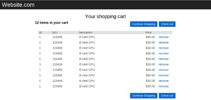
The AB test we ran was to determine which order was more effective. "Checkout then Continue Shopping" or "Continue Shopping then Checkout". With a big enough sample of course there was a winner. If we ran the test again multiple times, will the results be the same?
One metric I secretly tracked on the side was which of the buttons where clicked the most; the ones before the list of items in the shopping cart and the ones after. Every single time the bottom ones won. Maybe it's because the user would scroll down to see all the items in the cart first, then make a decision to continue shopping or checkout.
41 shades of blue

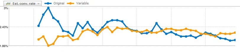
It's interesting to see a big company like Google do a large scale AB test to determine the best choice of links color. The part that get briefly mentioned is how it was determined which color is the most effective. "Whichever gets the most click" is boring compare to "41 shades of blue".
Did the user click because of the message on the text or its color. Did the user notice the color at all? If the default colors of a link on the web was yellow, if we tested 41 shades of yellow, how will it affect the result. If we ran the same test twice with the same sample size, would we have the same result?
I used this as an argument for a test I thought was unfair. Every time we ran the same experiment, we received different results. At the end the manager said "let's just go for the cleaner version then".
The Big Data argument
The argument is the bigger your sample size, the truer your result will be. This makes much sense when you are presenting numbers in a meeting. But if we are looking at a user and how he behaves in a situation, and why he behaves as such, we would toss most AB tests out the window.
Let's say we create a page with version A blue links and version B we replace all our links with baby pictures. We might get a higher click rate on version B because, well baby pictures! Or we might get no clicks at all because the Internet is tired of baby pictures. What matters is the story each version generates. Having a bigger sample only confirms the story not which button is more effective.
sorry, no baby pictures for you today.
Data can be interpreted in an infinite numbers of ways. I have seen a website that was losing revenue being described as a clear winner in a meeting. There was a 20% drop in traffic every month, but for that particular month, it only dropped by 8%. This was viewed as a 12% increase. In other words, the website had a positive rate of decline compare to the previous month. (8% of a small number is a very significant number)
AB test metrics have to tell a story. The user clicked on this blue text because he has been trained to recognize blue text as a link. If you change it to red and still get clicks, what is the story behind it? Is it the message of the text that suggest it is a link? or is it because the text before it is of different color?
AB test will bring you more questions then answers. There are too many factors that can influence a click and the metric you use will only give you the tip of the iceberg. If you have a something new to test, you will be better off testing it in a controlled environment.


Comments
There are no comments added yet.
Let's hear your thoughts